The Salvage Cafe Identity
The Salvage Cafe is one of Brightons hidden gem’s. From spending far too much time in there “working” and being a friend of the owner I’ve made this my showcase branding project. All the regulars agreed that the cafe had a feel of the place that the writers of history would meet and great novels were written, all very 20’s Paris, so that is what I set out to convey.
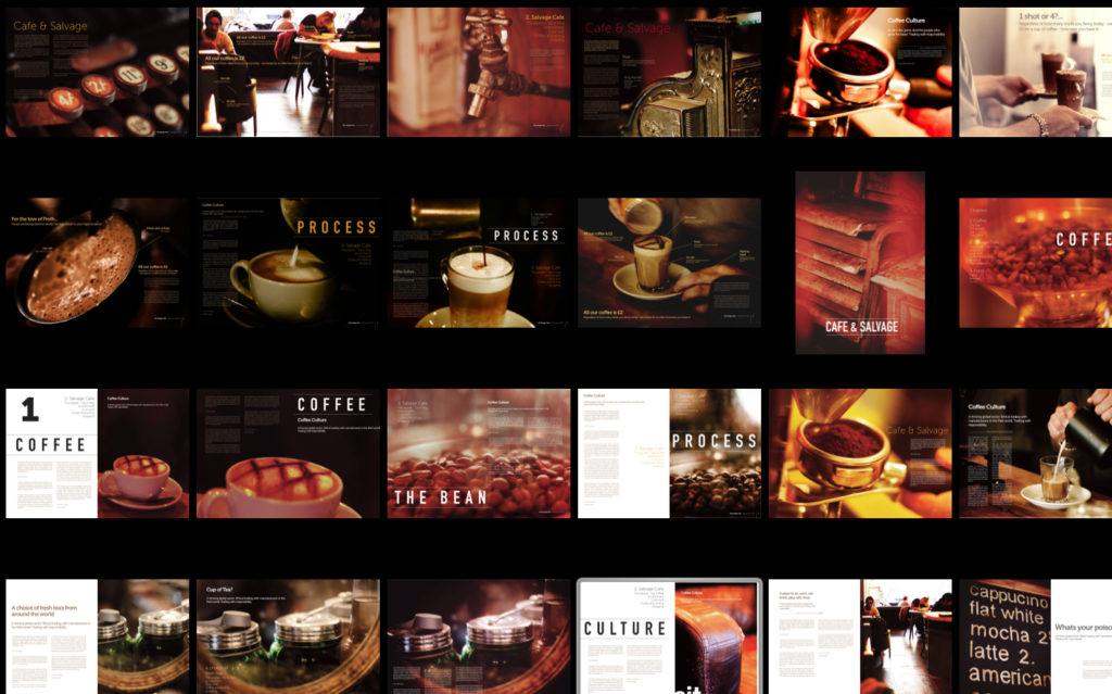
Photography
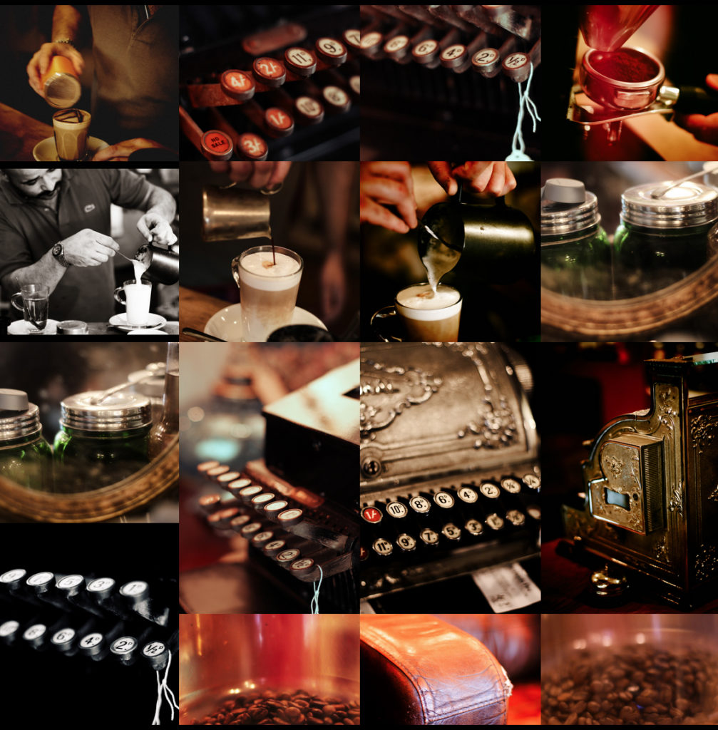
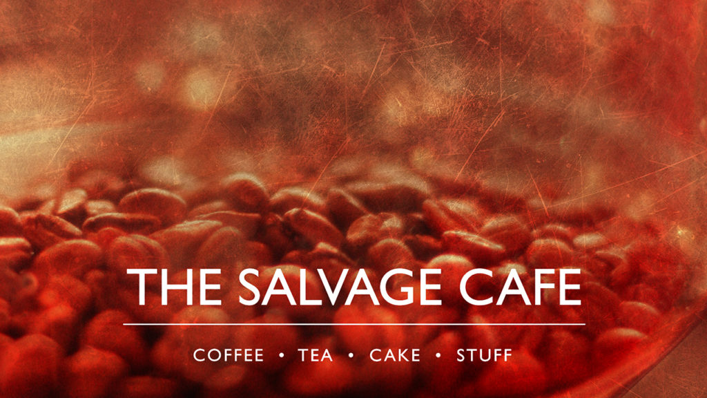
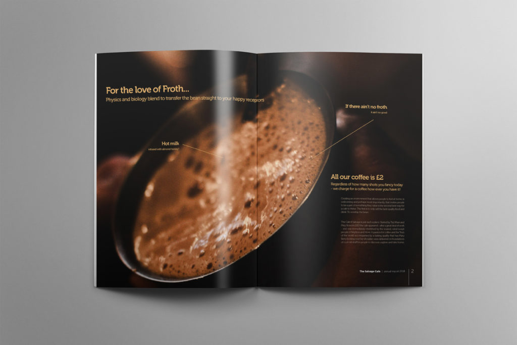
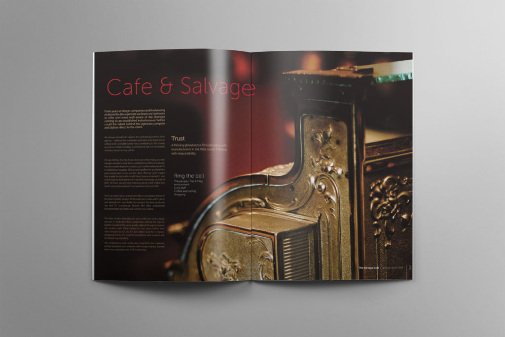
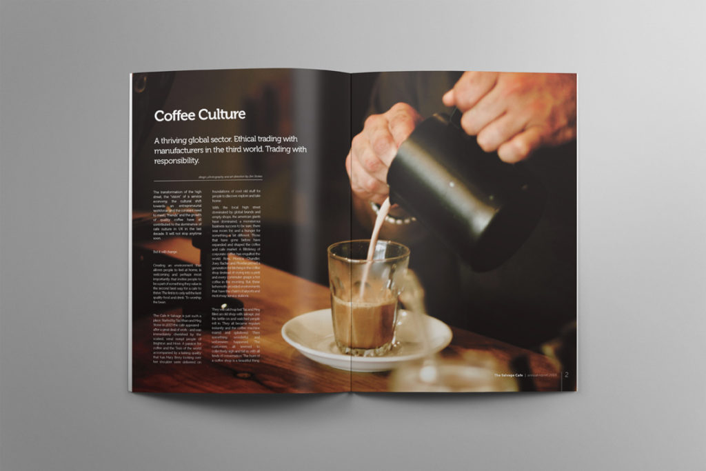
I started with a shoot and generated all the imagery you see here. A photo essay concentrating on the process of making coffee and the details and textures of the cafe – as everything is for sale, we needed to show all the lovely objects that make up the environment. I like to focus in and shoot close up to generate imagery that is crying out for typography. You can see the entire shoot here.
Logo & Identity Design
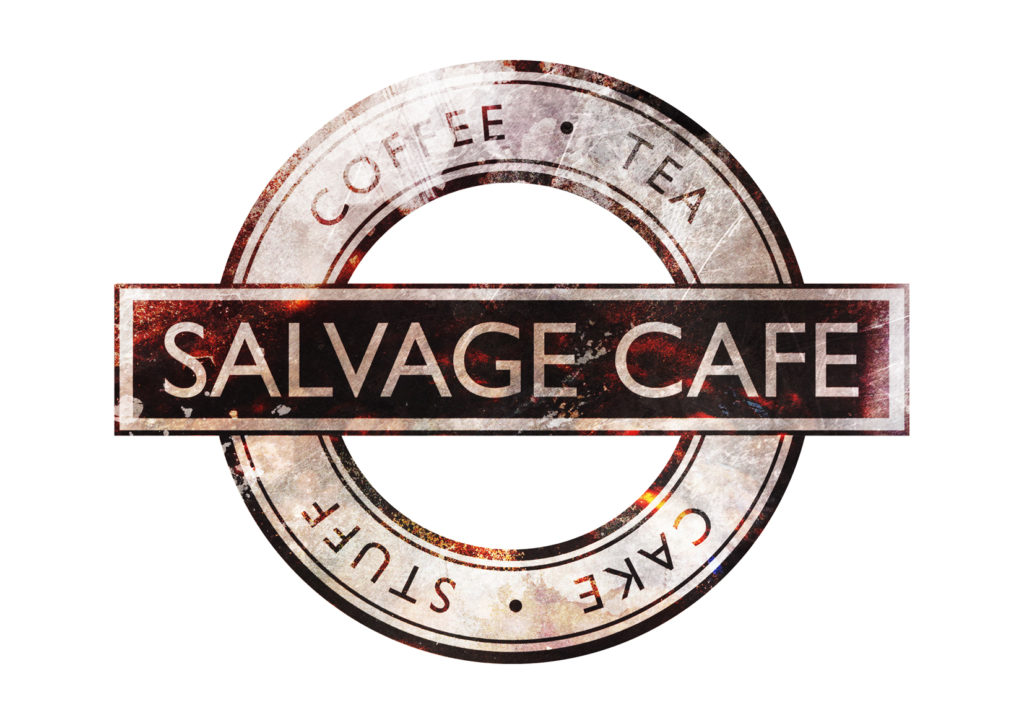
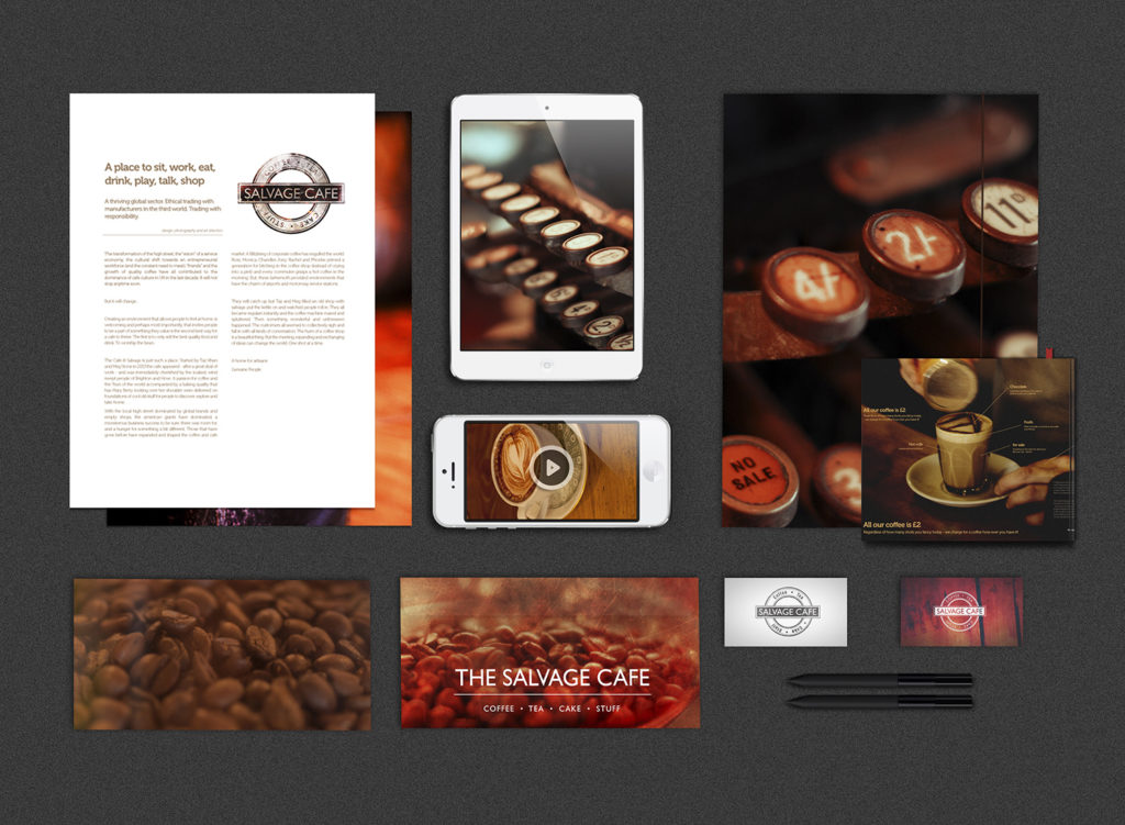
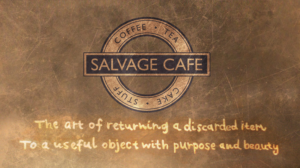
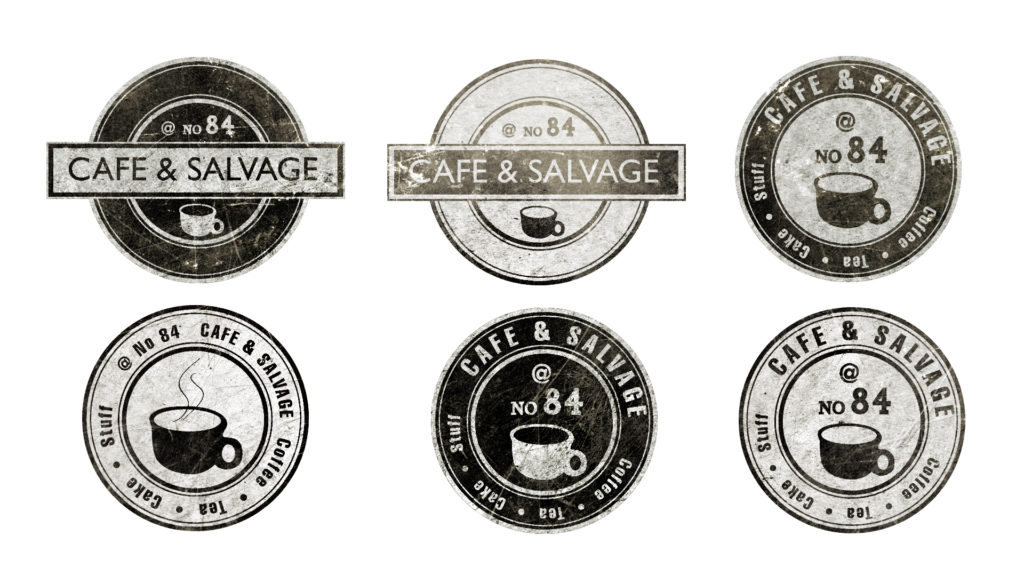
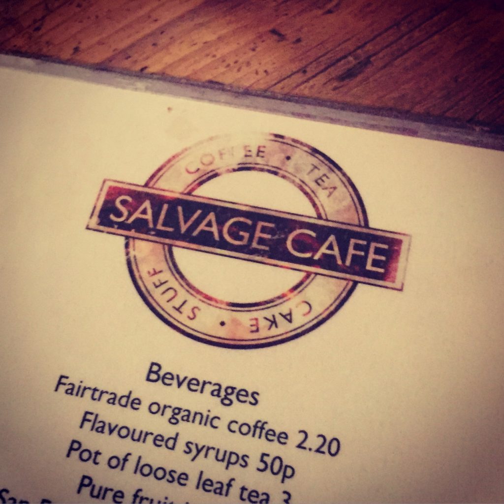
The client wanted the logo to work as a stamp and have a classic retro feel. All designed items were to feel like they were salvaged from another era. It also needed to be open to adaptation of different uses as the cafe and its services progressed.
Brand publishing
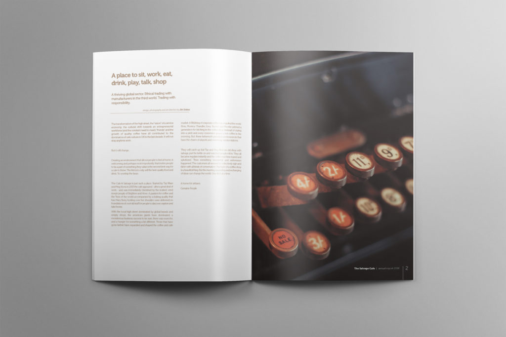
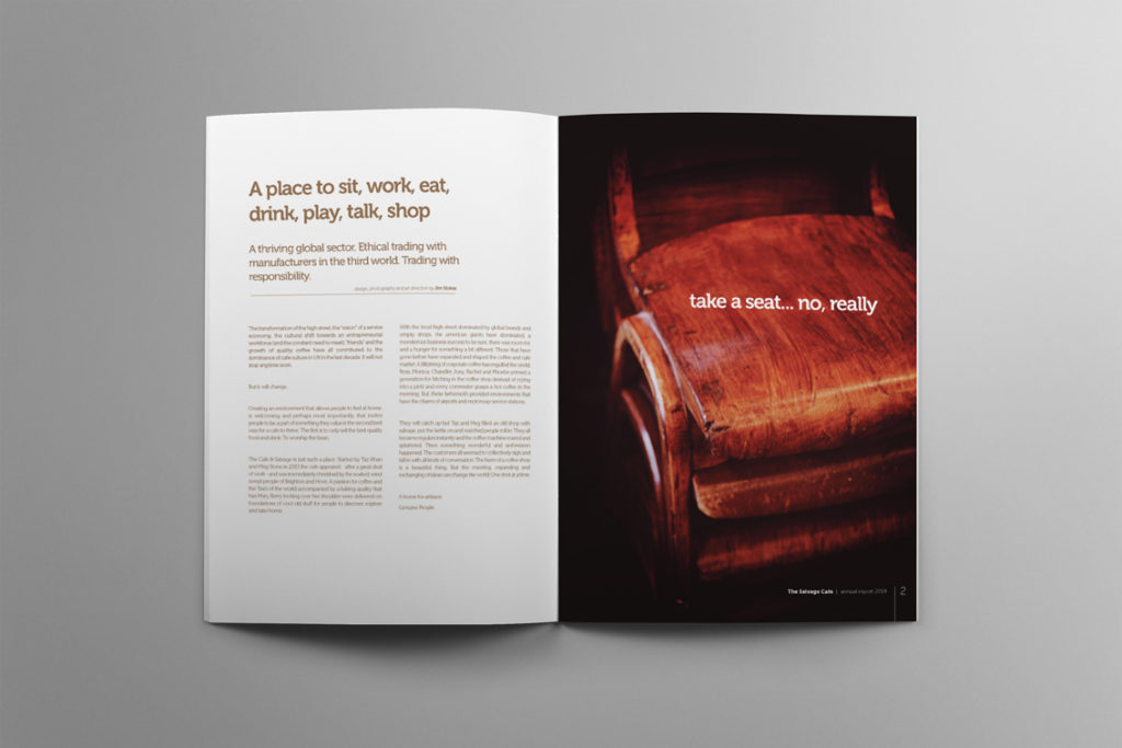
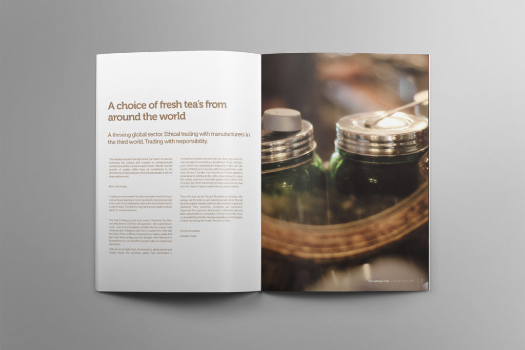
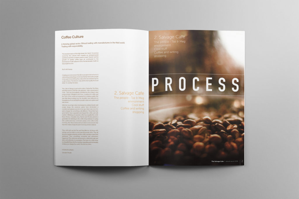
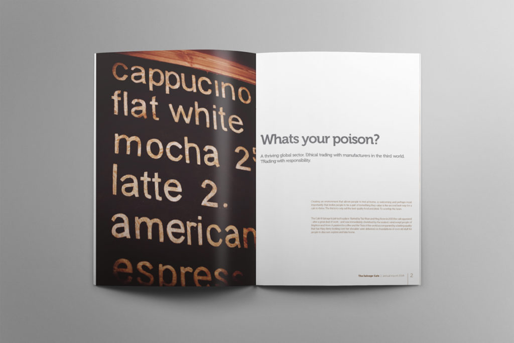
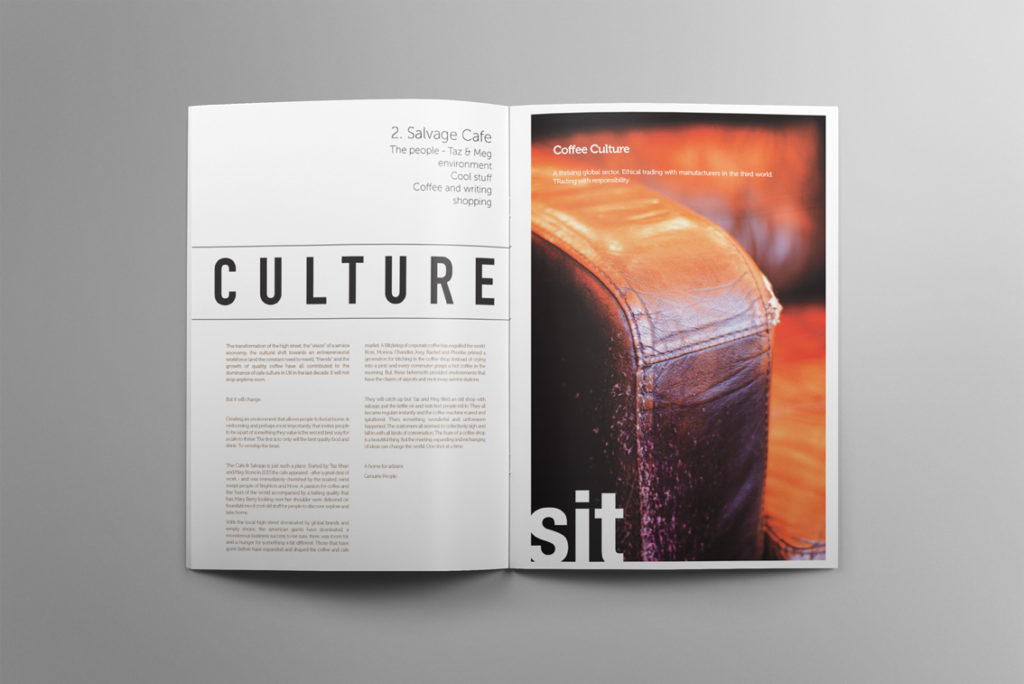
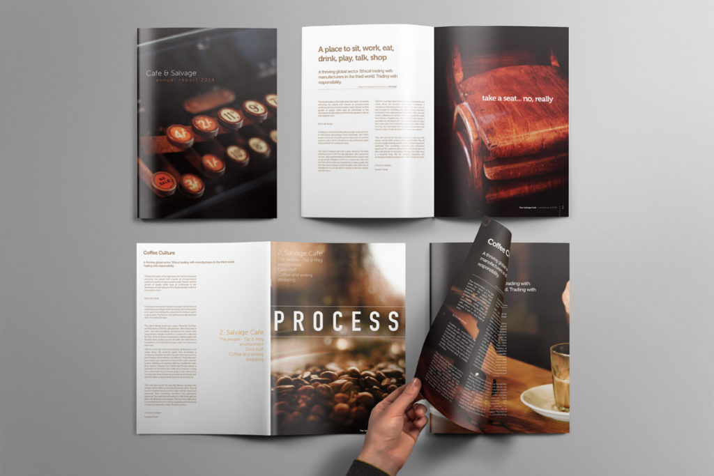
Once I’d created a selection of evocative images I worked up a series of designs for annual reports, leaflets, posters and digital publications. This included writing copy and developing language as I created brand with a classic feel.
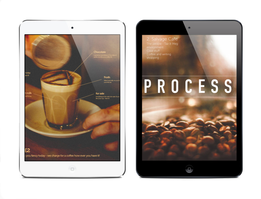
Digital
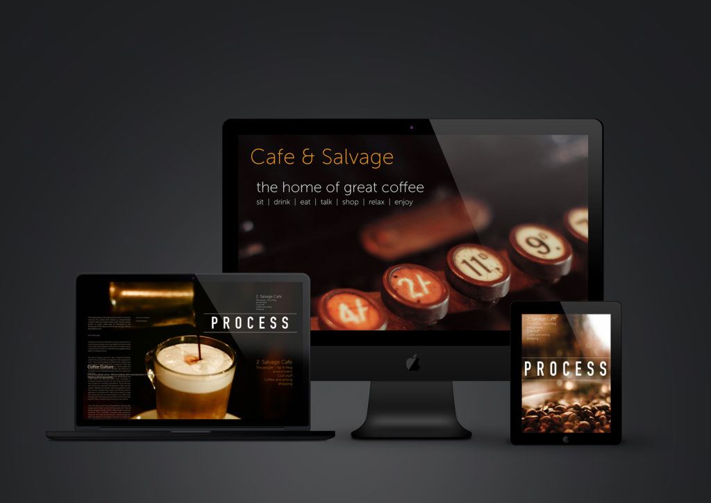
Once the brand and images had cone together I also applied the designs to all digital platforms.
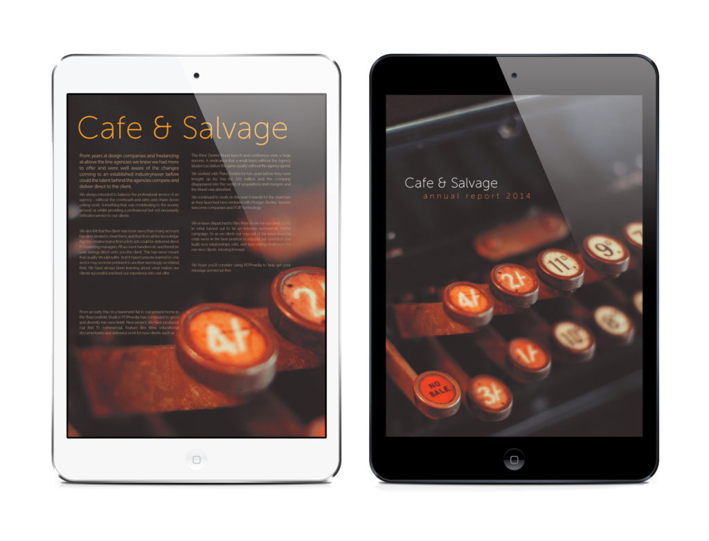
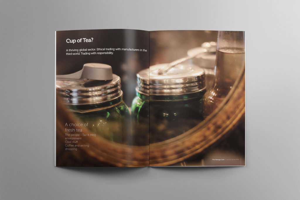
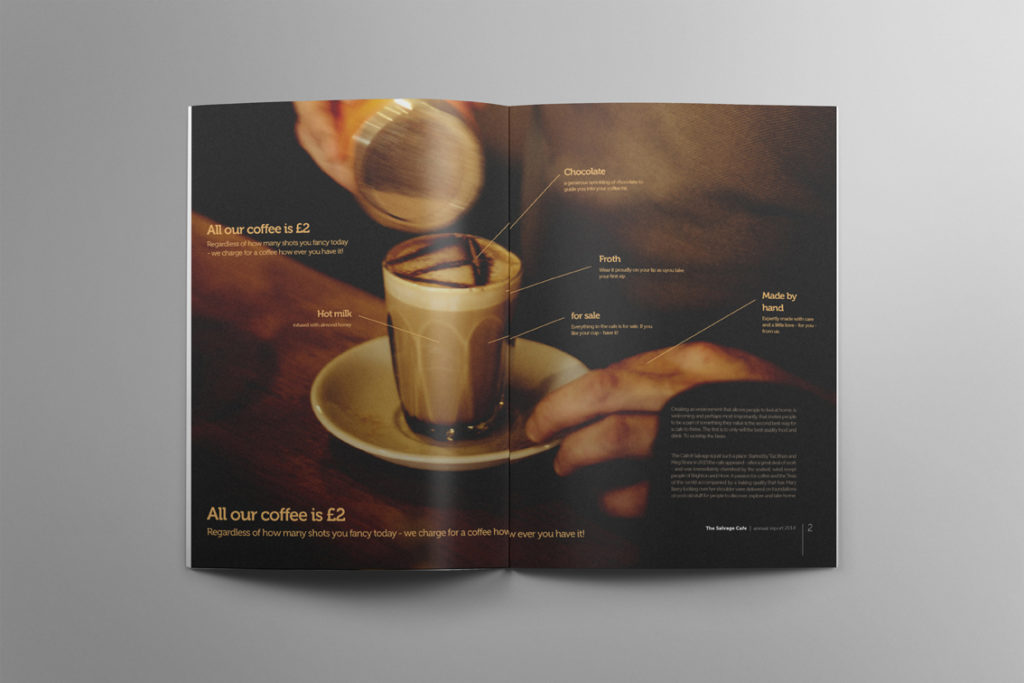
Annual Report
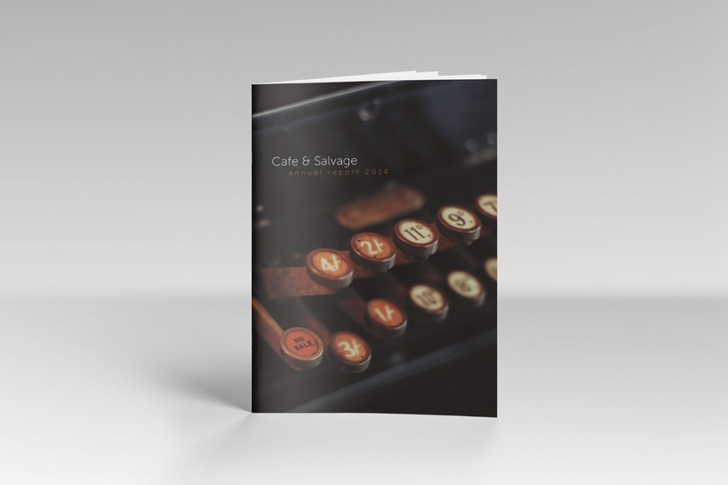
There was so many images to play with that I designed an annual report to show the brand coming together and provide a canvas for all the different images.
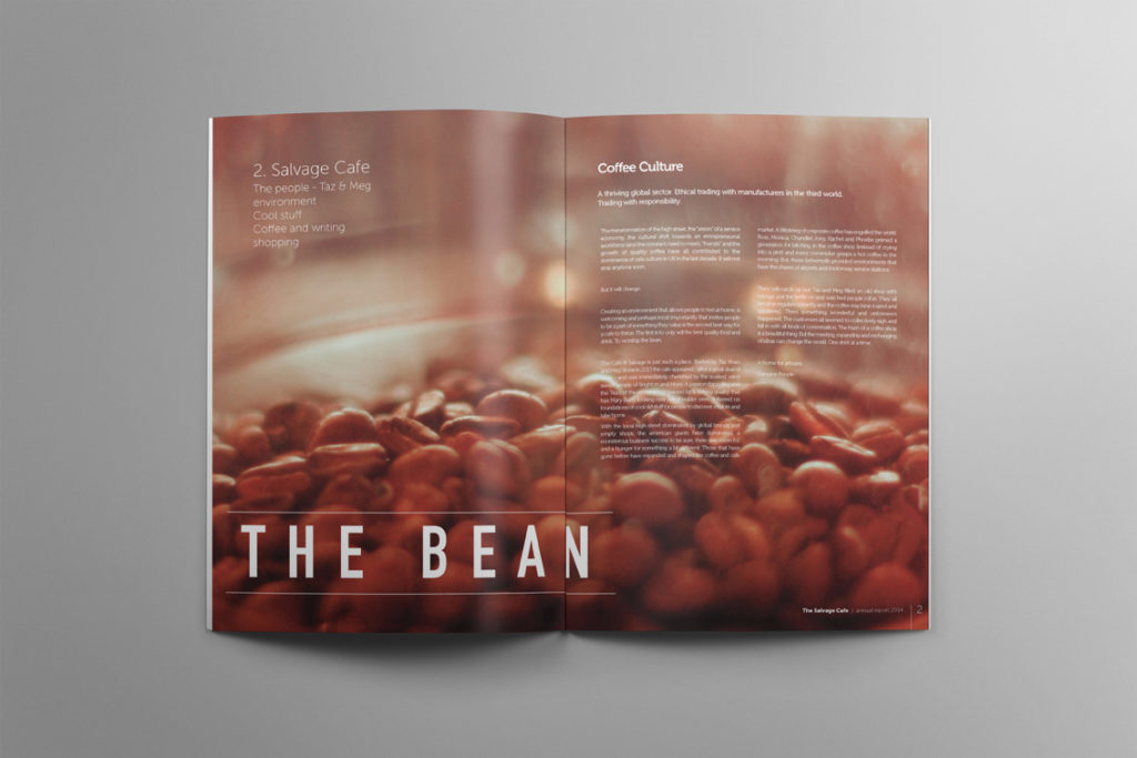
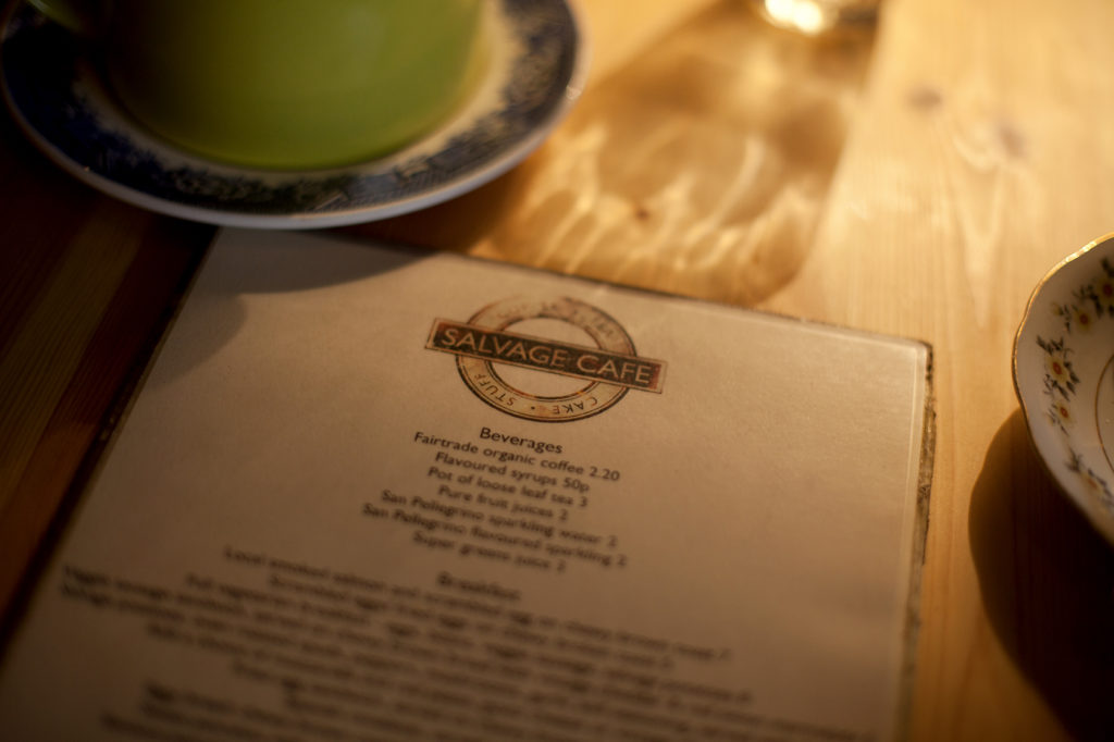
Applied brand identity
