
New identity for my design services.
I’ve been playing with digital textures, perspectives and a suggestion of scale, stability and a landscape of possibilities. The digital monolith with a sense of a rising sun behind it suggests new beginnings and multiple solutions.
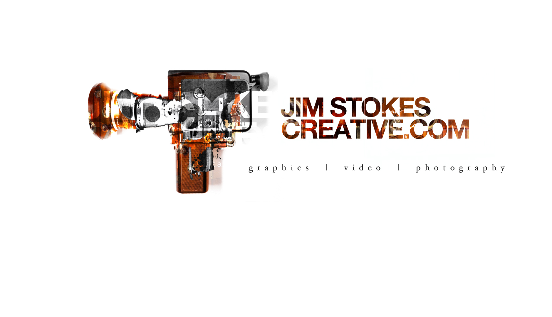
I’m usually all about lowercase type, but a bold and strong statement with a subtle, classic blend for services is working right now.


Running a few different shop fronts to cover my different services has been a hard fought lesson.
Initially I set up an integrated agency, providing design, consultancy, film, photography and illustration. Despite some very successful years, winning some major accounts and beating leading agencies I was still frustrated at the lack of awareness amongst new and existing clients. Our brand was successful and known, but the multi services agency model failed to break through the way I had planned. People do want to purchase from a specialist and small outfits struggle to compete regardless of the talent and ability in one studio.
So www.jimstokesdesign.com www.jimstokesphotography.com and www.jimstokescreative.com were born whilst www.popmedia.co.uk became a home for selling little prints for little places.
My three main services are all commissioned through their respective shop fronts and once new clients have become repeat clients effective cross selling can – and frequently does – happen.